
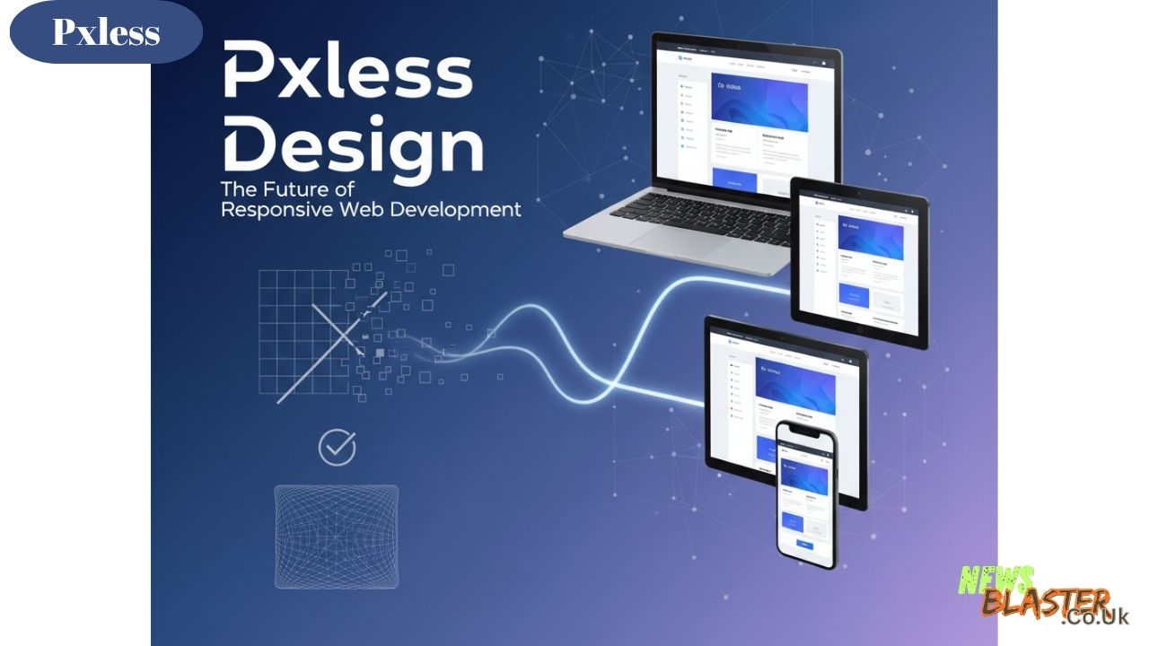
Have you ever opened a website on your laptop, loved how it looked, and then switched to your phone only to find everything looks wrong? Buttons are too small, text is cut off, or images spill over the screen. This issue is caused by designs that are too “pixel-dependent.” In simple terms, websites and apps that depend on pixel measurements for their layout can break when viewed on different devices or screen sizes. Enter pxless—a modern approach to responsive design that addresses this very problem. In this article, we will explore the definition of pxless, its importance in modern web design, and how it is changing the way we think about responsiveness across devices.
What is Pxless?
The term pxless comes from two key words: “px” and “less.” Px stands for pixels, the basic unit of measurement in digital screens that represent the smallest part of a digital image or display. When web designers use px, they are essentially fixing the layout in terms of pixels, meaning that elements like buttons, text, and images are sized exactly in pixel units, regardless of the size or resolution of the screen on which they appear. This approach leads to designs that can look perfect on one screen but break or look poorly formatted on others.
Less refers to moving away from this fixed pixel dependency, creating a design that is flexible and responsive. This approach allows elements to scale and adjust based on the screen’s size, making the design more adaptable across different devices such as desktops, tablets, and mobile phones.
In essence, pxless means a design that doesn’t rely on fixed pixel values but instead adapts fluidly to the size of the screen, making it a key feature of modern, responsive web design.
Why Pxless Matters in Modern Web Design
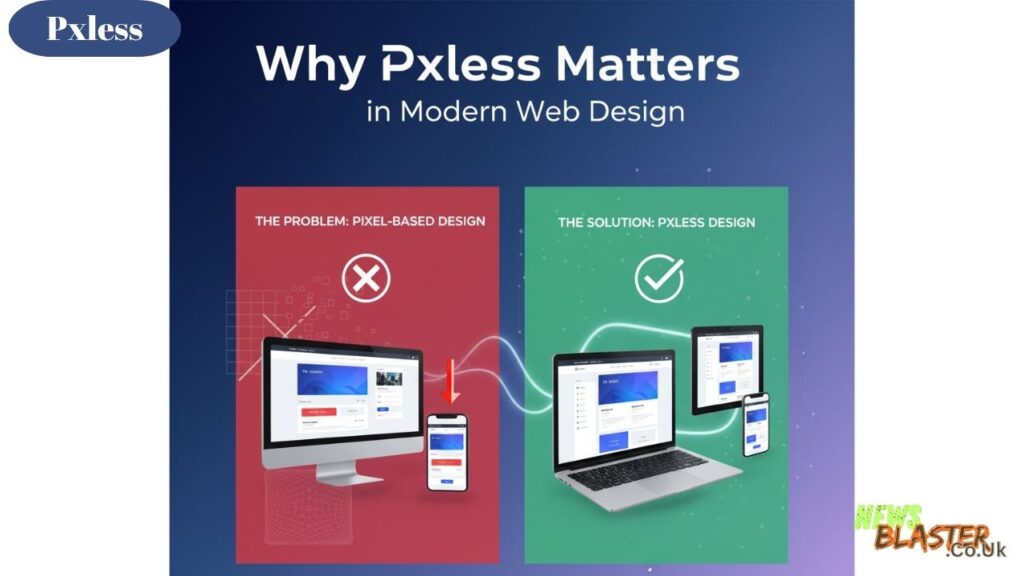
The Problem with Pixel-Based Design
Traditional web design relied heavily on fixed pixel measurements. Designers would specify that a button should be exactly 200px wide or a heading should be 24px tall. While this worked fine when most people browsed the internet on desktop computers with similar screen sizes, the explosion of mobile devices changed everything.
Today, people access websites from smartphones, tablets, laptops, desktop monitors, and even smart TVs. Each device has different screen dimensions and resolutions. A layout designed for a 1920px wide desktop monitor will look cramped and broken on a 375px wide smartphone screen. This is where the limitations of pixel-based design become painfully obvious.
The Flexibility of Pxless Design
Pxless design solves this challenge by using relative units instead of absolute pixel values. Instead of saying a container should be 800px wide, a pxless approach might use percentages, viewport units, or other flexible measurements. This means the container will adjust its width based on the available space, creating a seamless experience across all devices.
The beauty of this approach is that it creates designs that are truly device-agnostic. Whether someone views a website on a small phone or a large monitor, the layout adjusts intelligently to provide the best possible user experience. This adaptability is no longer optional in modern web development—it’s essential.
How Pxless Design Works
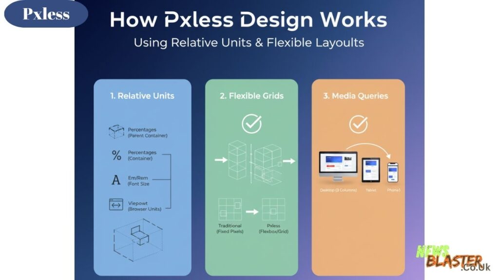
Using Relative Units
The foundation of pxless design lies in using relative measurement units instead of fixed pixels. Common relative units include:
Percentages allow elements to size themselves based on their parent container. If a div is set to 50% width, it will always take up half of its parent’s width, regardless of how large or small that parent is.
Em and Rem units are relative to font sizes. An em is relative to the font size of the parent element, while a rem is relative to the root font size of the document. These units ensure text and spacing scale proportionally.
Viewport units like vw (viewport width) and vh (viewport height) are relative to the size of the browser window itself. An element set to 50vw will always be half the width of the viewport, automatically adjusting as the window is resized.
Flexible Grids and Layouts
Pxless design often incorporates flexible grid systems. Instead of positioning elements at specific pixel coordinates, designers create grids that divide the screen into proportional sections. Modern CSS tools like Flexbox and CSS Grid make this approach much easier to implement.
These flexible layouts rearrange themselves based on available space. On a wide desktop screen, content might display in three columns. On a tablet, it might switch to two columns. On a phone, everything stacks into a single column. All of this happens automatically without requiring separate designs for each device.
Media Queries and Breakpoints
While pxless design emphasizes flexibility, designers still use media queries to define breakpoints where major layout changes occur. However, instead of thinking in terms of specific device sizes, they think about when the content naturally needs to reflow.
This content-first approach means the design adapts based on what looks best for the information being presented, rather than trying to target every possible device size with pixel-perfect precision.
Benefits of Adopting a Pxless Approach
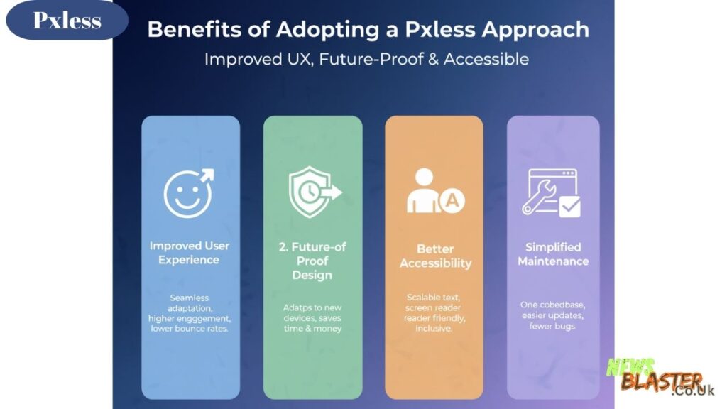
Improved User Experience
The most obvious benefit of pxless design is a better user experience. When websites adapt smoothly to any screen size, users don’t have to pinch, zoom, or scroll horizontally to view content. Everything just works, regardless of how they choose to access the site.
This seamless experience leads to lower bounce rates and higher engagement. Users are more likely to stay on a site that’s easy to use, and they’re more likely to complete desired actions like making purchases or filling out forms.
Future-Proof Design
Technology evolves rapidly. New devices with different screen sizes and resolutions appear constantly. A pxless approach creates designs that are inherently future-proof because they’re built to adapt rather than to fit specific dimensions.
Instead of redesigning a website every time a new popular device hits the market, pxless sites automatically adjust to accommodate new screens. This saves time and money in the long run while ensuring the design remains effective.
Better Accessibility
Pxless design often improves accessibility for users with disabilities. When text sizes are set using relative units, users who need larger text can adjust their browser settings, and the entire layout will scale appropriately. This wouldn’t work well with rigid pixel-based designs.
Additionally, the emphasis on flexible, content-first layouts often results in cleaner, more semantic HTML structures that work better with screen readers and other assistive technologies.
Simplified Maintenance
Maintaining a pxless website is generally easier than managing multiple pixel-perfect versions for different devices. Designers make changes once, and the flexible layout ensures those changes work across all screen sizes. This reduces the testing burden and minimizes the risk of device-specific bugs.
Implementing Pxless Design: Best Practices
Start with Mobile-First Thinking
Many designers now advocate for a mobile-first approach when creating pxless designs. This means designing for the smallest screens first and then progressively enhancing the experience for larger screens.
This approach forces designers to prioritize the most important content and functionality. If something works well on a small phone screen, it will almost certainly work on larger devices. The reverse isn’t always true.
Use Fluid Typography
Typography is a critical component of pxless design. Instead of setting text at fixed pixel sizes, designers use techniques like fluid typography that allows text to scale smoothly between minimum and maximum sizes based on the viewport.
This creates a reading experience that feels natural on any device. Text isn’t uncomfortably small on phones or absurdly large on desktop monitors—it’s always just right.
Test Across Real Devices
While browser developer tools are helpful for testing responsive designs, nothing beats testing on real devices. Designers should view their pxless designs on actual phones, tablets, and computers to ensure everything works as intended.
Different devices can render things slightly differently, and touch interactions behave differently than mouse clicks. Real-world testing catches issues that might slip through in simulated environments.
Embrace Flexibility, Not Perfection
One of the hardest shifts for designers transitioning to pxless design is letting go of pixel-perfect control. In a truly responsive, pxless design, elements may not align exactly the same way on every device—and that’s okay.
The goal isn’t identical appearance across all screens but rather optimal presentation for each context. Once designers embrace this mindset, pxless design becomes much more natural and liberating.
Common Challenges and Solutions
Images and Media
One challenge in pxless design is handling images and other media. Images have inherent dimensions in pixels, so making them flexible requires special attention.
The solution is to use responsive image techniques. Setting images to a maximum width of 100% allows them to scale down on smaller screens while never exceeding their natural size. Modern HTML also offers the picture element and srcset attribute, which let designers specify different image files for different screen sizes, optimizing both appearance and performance.
Complex Layouts
Very complex layouts can be challenging to make truly pxless. When designs have many interrelated elements that need to maintain specific spatial relationships, pure flexibility can sometimes cause unexpected results.
The solution is to use a combination of flexible and fixed units strategically. Critical relationships can use more rigid specifications while overall structure remains fluid. Modern CSS layout tools like Grid provide excellent control for managing these complex scenarios.
Browser Compatibility
While modern browsers have excellent support for the techniques used in pxless design, older browsers may not handle everything gracefully. This can create challenges for sites that need to support older technology.
Progressive enhancement is the answer. Designers create a solid, functional baseline that works everywhere, then layer on advanced flexible features for modern browsers. This ensures everyone can access the content, even if the experience isn’t identical.
The Future of Pxless Design
As web technology continues to evolve, pxless design principles are becoming even more important. New devices with folding screens, varying aspect ratios, and novel form factors are emerging regularly. The only way to create designs that work across this diverse landscape is to embrace flexibility fundamentally.
Modern CSS specifications are making pxless design easier to implement. Features like container queries, which allow elements to respond to their container’s size rather than the viewport, provide even more sophisticated tools for creating adaptive layouts.
The trend in web design is clearly moving toward more fluid, flexible approaches. As designers and developers become more comfortable with relative units and flexible thinking, pxless design will become the default rather than the exception.
Conclusion
Pxless design represents a fundamental shift in how we think about creating digital experiences. Instead of trying to control every pixel on every screen, designers create flexible systems that adapt intelligently to their context. This approach produces better user experiences, more maintainable code, and designs that stand the test of time.
Making the transition from pixel-based thinking to a pxless mindset requires practice and a willingness to let go of absolute control. However, the benefits—happier users, fewer maintenance headaches, and future-proof designs—make it well worth the effort.
Whether you’re a designer just starting to explore responsive design or a developer looking to refine your approach, embracing pxless principles will improve your work and better serve your users across every device they use.
Also Read: What Does “oo rn” Mean? The Viral Slang Taking Over Social Media